
Playful typography can inject humor into serious content by using creative fonts, vibrant colors, and fun layouts that grab attention and make messages more approachable. Combining whimsical, handwritten styles with clean sans-serifs, and pairing bright contrasting hues, helps create a lively, engaging vibe. Strategic font choices and color schemes reinforce the tone and invite viewers in. Keep exploring because mastering these techniques will help you craft memorable, entertaining designs that resonate.
Key Takeaways
- Use whimsical or handwritten fonts to create a playful, approachable tone that contrasts with serious content.
- Incorporate bright, contrasting colors to add energy and humor, making the message more engaging.
- Pair playful fonts with clean, straightforward fonts to balance fun and readability effectively.
- Apply unexpected font combinations and vibrant color schemes to inject humor and visual interest.
- Experiment with design elements to create memorable, lively visuals that make serious topics more relatable.

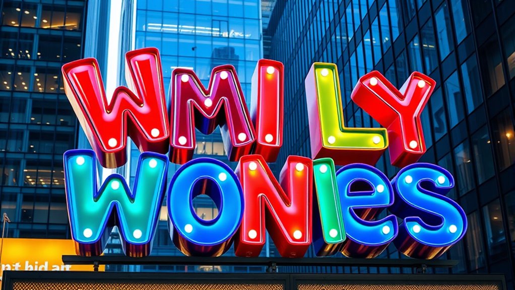
Have you ever noticed how playful typography can instantly grab your attention and set the tone of a design? It’s a powerful tool that transforms serious content into something approachable and engaging. When you approach playful typography, you’re not just choosing random fonts or colors; you’re intentionally crafting an experience that invites viewers to connect with your message. One of the core principles to master here is color theory. By understanding how colors interact and evoke emotions, you can enhance the playful feel of your typography. Bright, contrasting colors like yellow and purple, or vibrant reds and greens, can add energy and humor to your design. Conversely, softer pastel shades can tone down intensity while still maintaining a lively vibe. The key is to select colors that complement each other and support the overall tone you want to convey. Additionally, attention to detail and consistency in your design help maintain clarity and coherence.
Font pairing is equally essential in creating playful typography. Combining different fonts can add visual interest and showcase personality. For example, pairing a whimsical, handwritten font with a clean, sans-serif typeface can strike a balance between fun and readability. You want your font choices to work together harmoniously without clashing or overwhelming the viewer. When you mix fonts, think about contrast—bold versus delicate, rounded versus angular—to emphasize playful elements without sacrificing clarity. Experimenting with font pairing allows you to highlight key parts of your message or add humor through unexpected combinations. Remember, playful typography isn’t just about making things look lighthearted; it’s about thoughtfully using font styles and colors to reinforce your tone and engage your audience.
Furthermore, understanding key traits of successful designers can help you develop a more strategic approach to your playful typography projects.
As you craft your design, consider how color theory influences your choice of hues and how font pairing guides the overall aesthetic. You might choose a bright, cheerful palette with mismatched but complementary fonts to create a lively, humorous effect. Or, you could use a more subdued color scheme with quirky, unusual fonts to add subtle humor to a serious topic. The art lies in balancing these elements so they work together seamlessly. Playful typography invites experimentation—don’t be afraid to try bold color combinations or unexpected font pairings. When you do this thoughtfully, your design becomes more than just visually appealing; it becomes memorable and fun. Ultimately, mastering color theory and font pairing empowers you to inject humor into even the most serious content, making your message more relatable and enjoyable for your audience.
playful typography font bundle
As an affiliate, we earn on qualifying purchases.
As an affiliate, we earn on qualifying purchases.
Frequently Asked Questions
How Can Playful Typography Improve Audience Engagement?
Playful typography boosts audience engagement by creating a strong visual hierarchy that guides readers through your content effortlessly. When you use clever font pairing, it adds personality and humor, making serious topics more approachable. You’ll catch your audience’s eye and keep them interested longer, as the playful elements break the monotony. By combining these techniques, you make your message memorable and inviting, encouraging viewers to stay and interact with your content.
Are There Risks of Misinterpreting Serious Messages With Humor?
You might think humor always clarifies, but it can be a miscommunication pitfall if not handled carefully. Humor risks misinterpreting serious messages, especially when cultural sensitivities aren’t considered. You could unintentionally offend or confuse your audience, turning a meaningful message into a joke. To avoid this, test your playful typography with diverse groups, ensuring your humor resonates without crossing boundaries or diluting the seriousness of your content.
What Are the Best Tools for Creating Playful Typography?
You should explore tools like Adobe Illustrator and Procreate, which excel in creating playful typography. Use hand lettering techniques to add a personal touch, and experiment with font pairing strategies to balance humor with seriousness. These tools let you customize letterforms easily, helping you craft engaging, humorous content that resonates. With practice, you’ll develop unique styles that effectively combine playful typography with your message’s tone.
How Do Cultural Differences Affect Humorous Typography Design?
Cultural differences delicately dictate design decisions, affecting humor perception and tone. You must consider cultural nuances, as what’s witty in one culture might be wild or worrisome in another. Recognize regional references, language quirks, and societal sensitivities to guarantee your humorous typography resonates universally. By blending bold branding with cultural awareness, you create enthralling content that communicates clearly, avoiding misunderstandings and ensuring humor hits home across diverse audiences.
Can Playful Typography Be Used in Professional Branding?
Yes, you can definitely use playful typography in professional branding. It helps create a memorable corporate identity and boosts brand recall by making your message stand out. When used thoughtfully, playful fonts add personality without undermining professionalism. Just guarantee the design aligns with your brand values and target audience, balancing humor with clarity. This approach makes your brand more approachable and engaging, fostering stronger connections with your audience.

Welcome Sign Floral Garden Party Design with Handwritten Fonts, Whimsical Rehearsal Dinner Event Sign, Artistic Wedding Decor,
CUSTOMIZABLE DESIGN: Personalize your welcome sign with your name, graduation year, or any special message that celebrates your…
As an affiliate, we earn on qualifying purchases.
As an affiliate, we earn on qualifying purchases.
Conclusion
By embracing playful typography, you turn serious content into a canvas bursting with personality. It’s like adding a splash of color to a grayscale world, awakening your message with humor and charm. When you choose to infuse your designs with whimsy, you invite your audience to see beyond the words and into a lively, engaging story. So, don’t just communicate—make your message dance, ripple, and sparkle like sunlight on water, leaving a lasting impression.
bright contrasting color palette for typography
As an affiliate, we earn on qualifying purchases.
As an affiliate, we earn on qualifying purchases.
font pairing guide for playful designs
As an affiliate, we earn on qualifying purchases.
As an affiliate, we earn on qualifying purchases.