To master mixing patterns and prints, balance scale, color, and placement. Pair small prints with larger ones for harmony and use neutral or monochrome patterns as anchors. Mix bold patterns thoughtfully, keeping statement pieces limited and balancing with solid accessories. Layer prints with complementary directions or textures, and consider pattern placement for visual interest. Continue exploring these tips, and you’ll discover the art of creating cohesive, stylish, and eye-catching outfit combinations effortlessly.
Key Takeaways
- Balance small and large-scale prints for visual harmony, avoiding pairing two big patterns together.
- Coordinate patterns by sharing overlapping colors or tones for seamless integration.
- Limit bold pattern clashes to two statement prints and anchor with solid-colored accessories.
- Layer patterns thoughtfully by using base prints and aligning directional elements for cohesion.
- Incorporate texture and accessories to unify diverse prints and enhance overall styling.
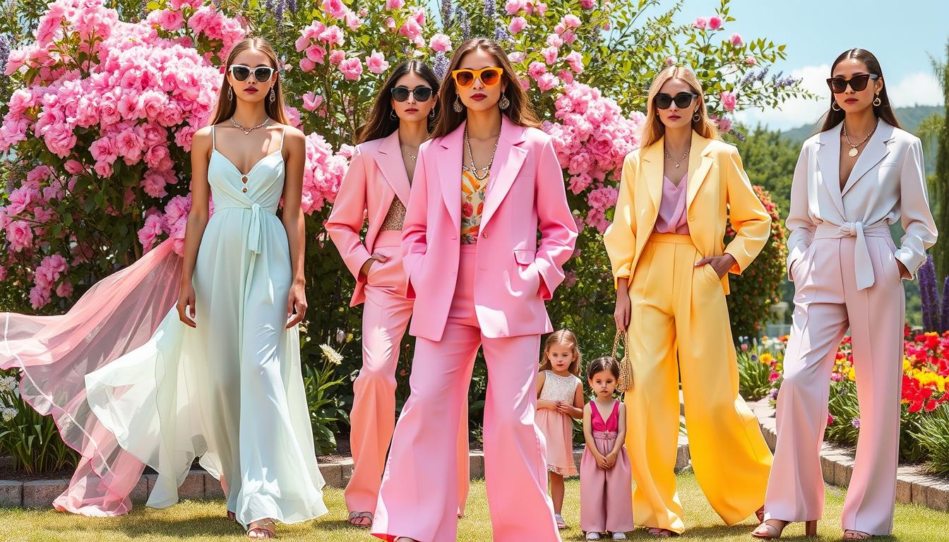
Mastering the art of mixing patterns and prints can elevate your style with creativity and confidence. When you’re combining different patterns, the key is balance. Pair small-scale prints with medium or large-scale patterns to create visual harmony, so one doesn’t overpower the other. Avoid mixing two large-scale prints, as that can overwhelm your outfit and make it feel chaotic. Instead, blend busy prints with simpler designs to keep everything feeling cohesive. Think of smaller prints as neutrals—layer them with bold patterns to ground the look without competing for attention.
Balance small and large patterns to create harmonious, eye-catching outfits.
Also, pay attention to proportion: your garments should match the scale of their patterns. A petite floral print works well on a fitted dress, while bigger prints suit looser, relaxed pieces. Incorporating pattern scale into your styling choices helps create more intentional and polished combinations.
Color coordination is equally important. Choose patterns that share at least one overlapping hue to tie your outfit together seamlessly. Mixing monochrome prints with multicolored ones that contain matching shades can create a unified look. Neutral-toned prints like black and white serve as anchors, allowing you to experiment with more vibrant patterns without losing balance. For a bold statement, try pairing the same print in contrasting colors, but limit your palette to two or three primary shades to avoid overwhelming the eye.
Don’t shy away from clashing bold prints—intentional clashes can add excitement. Combine animal patterns with plaids or geometrics, but do so thoughtfully. Anchor these daring pairings with solid-colored outerwear or accessories to keep the focus balanced.
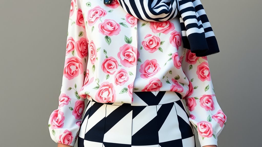
Textural contrast also helps: a silk floral print next to a tweed pattern creates visual interest without chaos. Limit powerful clashes to two statement patterns per outfit and use footwear or accessories to reinforce color continuity, tying everything together.
Start with foundation prints like stripes, polka dots, or subtle florals. Layer secondary patterns, such as paisley or abstract designs, over these bases, making sure their directional elements align—vertical stripes with vertical floral stems, for example. Combining organic floral shapes with geometric patterns offers a sophisticated contrast. Striped garments can serve as neutral bases for more experimental mixes, giving you a flexible starting point.
When distributing patterns, apply bold prints selectively through accessories like scarves or handbags. Use an uneven ratio—like 70% solid, 30% patterned—to keep things balanced. Printed outerwear over solid layers creates controlled contrast, while small patterns in jewelry or hardware details subtly add interest.
Balance pattern placement on your upper and lower body—pair a printed top with a solid bottom, or vice versa. Incorporating pattern repetition across your outfit can enhance harmony and cohesiveness in your look.
Advanced layering takes your look further. Introduce a third pattern with sheer garments or lining details, or combine similar floral patterns in different scales for cohesion. Textured solids such as cable knits or corduroy act as buffers, softening transitions. Pattern-on-pattern tailoring, like a printed blazer over a printed dress, can be striking if done carefully. Transition gradually from small to large scale across layers to maintain flow.
Finally, accessories can unify your pattern mix. Match printed accessories to secondary hues in your clothing, and use neutral-toned accessories to break up busy patterns. Limit printed accessories when your garments already feature multiple prints, and echo patterns in miniature versions on shoes or hats for subtle harmony. Maintaining consistent hardware finishes across all pattern elements completes your look, ensuring your patterns work together in perfect harmony.

Zhamate Fashion Scarves for Women Multifunctional Purse Scarf 18 Colors
Vibrant Boho Patterns: This set features 18 uniquely designed scarves with stripes, hearts, checks, and floral prints, offering…
As an affiliate, we earn on qualifying purchases.
As an affiliate, we earn on qualifying purchases.
Frequently Asked Questions
How Do I Choose the Right Patterns for My Body Shape?
When choosing patterns for your body shape, focus on size and placement. If you’re curvier, opt for smaller, detailed prints to create a slimming effect.
For a slender figure, bold, large patterns can add volume. Vertical stripes can make you appear taller, while horizontal ones widen.
Make sure the pattern proportion complements your body, balancing your overall look and highlighting your best features confidently.
Can Mixing Patterns Be Appropriate for Professional Settings?
Imagine a sleek, modern conference room where subtle patterns create visual interest without overpowering. Mixing patterns can be appropriate in professional settings if you keep them balanced.
Use a dominant pattern paired with smaller, complementary ones, sticking to a cohesive color palette. Incorporate neutral solids to anchor the look, and choose formal, understated patterns like stripes or plaid.
This approach adds sophistication while maintaining a polished, professional atmosphere.
What Color Combinations Work Best When Mixing Prints?
When mixing prints, you want to focus on color combinations that create harmony or contrast. Using a common color in both prints helps tie the look together.
Pairing complementary colors from the opposite sides of the color wheel, like blue and orange, adds visual interest.
Monochromatic schemes with different prints in one color also work well.
Always consider balance, mixing bold and subtle prints to keep your outfit cohesive and eye-catching.
How Do I Balance Bold Patterns With Subtle Ones?
To balance bold patterns with subtle ones, you should start by making the bold pattern the focal point, then add subtle patterns to complement it.
Use neutral solids to tone down the look and prevent visual overload. Mix large, eye-catching prints with smaller, delicate ones, and distribute them evenly across your outfit.
Keep accessories minimal, so the patterns remain the star, creating a harmonious, stylish look.
Are There Cultural Considerations When Mixing Traditional Prints?
When mixing traditional prints, you should be mindful of cultural considerations. Respect their origins by researching their history and significance.
Avoid stereotypes, and aim to honor the culture through thoughtful, authentic integration. Collaborate with artists from that culture whenever possible to guarantee accuracy.
Be aware of legal rights and ethical practices, like fair trade and intellectual property. Your goal is to celebrate and educate, fostering appreciation instead of appropriation.

COOFANDY Men's Abstract Gradient Geometric Print Shirt Casual Shirt for Spring Summer Holiday
COOFANDY LINEN SHIRT — Mens Casual Button Down shirt is made of high quality cotton linen fabric. Feature…
As an affiliate, we earn on qualifying purchases.
As an affiliate, we earn on qualifying purchases.
Conclusion
Mastering the art of mixing patterns and prints can elevate your style effortlessly. Did you know that 65% of fashion enthusiasts find bold pattern combinations boost their confidence? By experimenting with different textures and colors, you’ll create unique, eye-catching outfits that reflect your personality. Remember, it’s all about balance and fun. So go ahead, embrace your creativity, and turn everyday looks into expressive works of art. Your signature style is just a pattern away!

8 Pcs Matte Hair Clips for Women, Strong Hold Non-Slip Claw Clips for Girls, Flower Hair Clips for Thin Hair, Rectangle Claw Clips for Thick Hair, Neutral Colors Hair Accessories (Deep Leopard)
NEUTRAL MATTE & VERSATILE DESIGN: 8-piece set includes 2 rectangle clips, 2 flower clips, 2 medium rectangle clips,…
As an affiliate, we earn on qualifying purchases.
As an affiliate, we earn on qualifying purchases.

WIHOLL Boho Tops for Women Spring Trendy Summer Vacation Outfit Short Sleeve Shirts Plus Size Fashion Clothing Vintage Cruise Outfits Leopard Print Black XL
✦ Design: This trendy tops feature short sleeve shirts with a stylish raglan sleeve design and bold contrast…
As an affiliate, we earn on qualifying purchases.
As an affiliate, we earn on qualifying purchases.