
Colors greatly influence your design choices and how your audience perceives your message. Bright hues like red or orange energize viewers and prompt quick reactions, while softer blues and greens evoke calm and trust. Cultural context also shapes how colors are understood, so choosing the right palette can strengthen emotional connections and reinforce your brand’s identity. Understanding these color influences helps you craft visuals that resonate—if you want to discover how to use them effectively, keep exploring.
Key Takeaways
- Colors evoke specific emotions, guiding audience feelings and reactions to enhance message effectiveness.
- Strategic color choices establish visual hierarchy, directing attention to key elements and improving message clarity.
- Different cultures interpret colors uniquely, influencing perception and preventing miscommunication in diverse audiences.
- Vibrant hues energize viewers and prompt quick actions, while muted tones promote calmness and trust.
- Consistent use of brand colors reinforces recognition, emotional connection, and overall audience engagement.

Have you ever wondered how colors influence the way people perceive and respond to your designs? Colors are powerful tools that evoke emotions—happiness, sadness, excitement—and shape how your audience interprets your work. When you choose the right hues, you guide viewers’ feelings and reactions, making your design more effective. For instance, vibrant colors like red or orange can energize viewers, prompting quick actions or feelings of enthusiasm.
Conversely, muted tones such as soft blues or greens foster calmness and tranquility. Understanding this emotional influence allows you to craft designs that resonate deeply and elicit specific responses. Recognizing the importance of color psychology helps you select hues that align with your desired message and audience response. Additionally, the impact of colors on behavior plays a crucial role in how viewers engage with your content and make decisions based on visual cues. Being aware of the cultural significance of colors ensures your designs communicate appropriately across diverse audiences and contexts.
Colors also impact behavior, especially in marketing and branding. When you use consistent colors across your branding materials, you make your brand more memorable and recognizable. Think of how easily you identify brands like Coca-Cola, Facebook, or McDonald’s by their signature colors. These colors become linked with the brand’s identity, fostering trust and familiarity. Moreover, understanding color associations can help you select hues that reinforce your message and create emotional connections with your audience. The psychology of color choices is a crucial aspect of effective branding strategies.
Furthermore, different colors can sway decision-making. For example, red’s association with urgency often makes it ideal for call-to-action buttons or sales promotions, encouraging immediate responses. Knowing how to leverage color psychology helps you steer consumer behavior and enhance engagement.
However, it’s essential to recognize that colors don’t carry the same meaning everywhere. Cultural variations influence how colors are perceived. In some cultures, white symbolizes purity, while in others, it’s linked to mourning. When designing for diverse audiences, you must consider these differences to avoid misinterpretation.
Additionally, the context in which you use colors matters. A bright yellow can evoke optimism in one setting but appear garish or overwhelming in another. The psychological effects of colors are nuanced and depend heavily on how and where they’re applied.
In your designs, colors also serve a strategic role in establishing visual hierarchy. Bright or contrasting colors draw attention to key elements, guiding viewers through your message effortlessly. They help create emotional resonance—using energetic hues for excitement or subdued shades for sophistication.
When you select colors thoughtfully, you reinforce your message and strengthen your brand identity. This alignment encourages your audience to connect on a deeper level, making your communication more compelling and memorable.
Ultimately, incorporating color psychology into your work elevates your design’s impact. Whether you’re crafting a presentation, developing branding materials, or designing a website, choosing the right colors can influence perceptions, evoke emotions, and motivate actions.

Color Theory Poster, 16"x24", Quick Reference Poster for Classroom
Premium Quality Paper: Crafted from durable 260 GSM paper, our poster offers a premium feel and lasting strength….
As an affiliate, we earn on qualifying purchases.
As an affiliate, we earn on qualifying purchases.
Frequently Asked Questions
How Do Cultural Differences Affect Color Perception in Design?
Cultural differences profoundly shape how you perceive colors in design. You might see red as love in the West, but it symbolizes luck in China.
Blue can evoke trust in some cultures and immortality in others.
When designing globally, you must consider these varied meanings to avoid miscommunication.
Adapting your color choices based on cultural context helps you connect effectively with diverse audiences and enhances your brand’s success worldwide.
Can Color Choices Influence Customer Purchasing Decisions Effectively?
Research shows that specific color choices can boost brand recognition by up to 80%. When you select colors like red for urgency or yellow for attention, you influence customer behavior directly.
You make products more appealing, stimulate impulse buys, and evoke emotional responses, like trust or excitement. By understanding these effects, you can craft impactful branding and marketing strategies that drive sales and foster customer loyalty effortlessly.
How Do Color Combinations Impact Overall Design Harmony?
You see, color combinations directly impact overall design harmony by creating visual balance and coherence. When you choose complementary or analogous colors, you foster a sense of unity that’s pleasing to the eye.
Proper harmony guides viewers effortlessly through your design, making it more engaging and professional. If you mismatch or clump colors without thought, it can feel disorganized or jarring.
What Role Does Color Psychology Play in Branding Strategies?
Color psychology plays a pivotal role in branding strategies, shaping perceptions and sparking responses. You can leverage specific hues to evoke emotions—red for urgency, blue for trust, green for growth.
Consistent color use builds brand recognition, while thoughtful choices align with your brand personality. By understanding cultural cues and testing variations, you guarantee your brand’s colors communicate clearly, connect deeply, and create a lasting, loyal impression on your audience.
Are There Universal Color Preferences Across Different Demographics?
You’re wondering if any colors appeal universally across demographics. Generally, blue stands out as a favorite for many, thanks to its calming and trustworthy qualities. However, preferences vary based on age, culture, and context.
Younger groups embrace brighter, bolder hues, while older audiences prefer softer tones. Cultural influences also shape color meaning, so while some trends are widespread, no single color resonates equally across all groups.
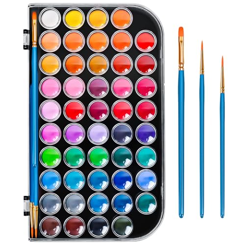
48 Color Solid Watercolor Paint Set with 3 Wooden Brushes – Non-Toxic, Vibrant & Washable Watercolor Kit for Artists, Children, Beginners, Kids – Portable Watercolor Painting Set for Travel & Studio
Rich & Vibrant 48-Color Palette—Unleash your creativity with our extensive set of 48 highly pigmented solid watercolor cakes….
As an affiliate, we earn on qualifying purchases.
As an affiliate, we earn on qualifying purchases.
Conclusion
In your design, remember that colors craft connections, evoke emotions, and influence impressions. By blending boldness with balance, you build bridges between your message and your audience’s perception. Use vibrant hues to inspire enthusiasm or subtle shades to foster trust. When you wisely wield colors, you wield power—creating mesmerizing, compelling content that captures hearts and minds. So, select, set, and style your shades with strategic sincerity, and watch your designs deliver dynamic, decisive results.
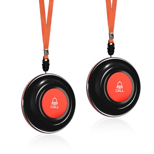
CallToU Wireless Call Buttons for Caregiver Pager and Calling System Waterproof Nurse Alert Call Buttons for Clinic Nurses Station Restaurant Nursing Home(Need to Be Paired with Receiver to Work)
The call button need to be paired with the receiver then the unit can work.
As an affiliate, we earn on qualifying purchases.
As an affiliate, we earn on qualifying purchases.

Art: The Definitive Visual Guide (DK Definitive Cultural Histories)
As an affiliate, we earn on qualifying purchases.
As an affiliate, we earn on qualifying purchases.