
Vintage fonts and retro typography are making a strong comeback, bringing nostalgic charm to modern design. You’ll see these styles in branding, advertising, and digital media, blending historical appeal with fresh creativity. Combining bold, decorative scripts with simple sans-serifs creates dynamic visual hierarchies that balance old and new. Thoughtful color schemes and careful font pairing ensure your designs feel authentic yet relevant. Keep exploring to discover how to craft mesmerizing vintage-inspired visuals that stand out.
Key Takeaways
- Vintage fonts and retro typography are experiencing a resurgence across branding, advertising, and digital media, emphasizing nostalgia and timeless style.
- Effective font pairing combines ornate, decorative scripts with simple sans-serifs to create a dynamic, cohesive vintage aesthetic.
- Classic color schemes like muted earth tones, faded pastels, and rich hues enhance the nostalgic feel of vintage typography designs.
- Balancing contrast and readability is essential to ensure vintage fonts remain legible while maintaining authentic retro appeal.
- Thoughtful integration of vintage fonts and color palettes results in cohesive, eye-catching designs that evoke different eras with a modern touch.
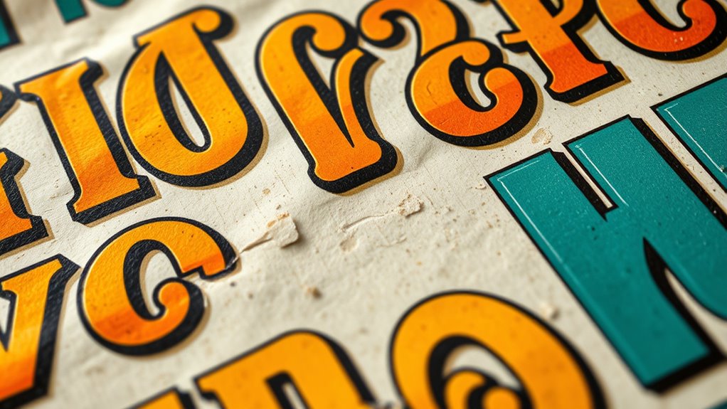
Have you noticed vintage fonts and retro typography making a strong comeback in design? It’s a trend that’s gaining momentum across branding, advertising, and digital spaces. You might find yourself drawn to the nostalgic charm of these fonts, which evoke a sense of history and timeless style. When integrating vintage fonts into your projects, one of the most effective strategies involves thoughtful font pairing. Combining different typefaces—such as a bold, decorative script with a clean, simple sans-serif—can create a dynamic visual hierarchy that captures that retro vibe. The key is to balance ornate and minimal elements, ensuring your message remains clear while still maintaining that nostalgic appeal.
Color schemes play a pivotal role in emphasizing the vintage aesthetic, and selecting the right palette can dramatically impact your design’s success. Think muted earth tones, faded pastels, or classic combinations like teal and burnt orange. These colors evoke a sense of age and authenticity, helping your design feel rooted in a specific era, whether it’s the 70s, 80s, or early 20th century. When pairing fonts, consider how your chosen color schemes can enhance the overall mood. For example, pairing a bold, vintage display font with a pastel background can create a soft yet striking effect that resonates with retro sensibilities. Conversely, combining dark, rich hues with gold or metallic accents can lend a luxurious, vintage touch to your branding.
Selecting the right vintage color palette enhances nostalgic design and elevates overall mood.
You’ll want to pay close attention to contrast and readability when mixing fonts and colors. Vintage fonts are often decorative, and if paired poorly or used with clashing color schemes, they can become illegible or overwhelming. To avoid this, keep your font pairings balanced—use one font for headlines and another for body text, ensuring they complement each other without competing for attention. As for colors, maintain sufficient contrast to make your text pop but avoid overly bright or neon shades that clash with the vintage feel. Subtle, deliberate choices in font pairing and color schemes help reinforce that nostalgic vibe while keeping your design polished and modern.
Ultimately, embracing the vintage fonts and retro typography comeback means understanding how to blend different elements thoughtfully. Your goal should be to craft a cohesive look that transports viewers to a different time while still feeling fresh and relevant today. With the right font pairing and carefully chosen color schemes, you can create designs that are both eye-catching and rich with nostalgic charm. This approach lets you tap into the emotional appeal of vintage style, making your work stand out in a crowded visual landscape.

Rustic Felt Letter Board Ultimate Bundle Farmhouse Vintage White Wood Frame and Stand by Felt Creative Home Goods Changeable Message Memo Board 800+ Letter Set (Black, 10×10)
🌾 EXCEPTIONAL QUALITY, HANDMADE RUSTIC FELT LETTER BOARDS – At Felt Creative Home Goods, craftsmanship meets character. Our…
As an affiliate, we earn on qualifying purchases.
As an affiliate, we earn on qualifying purchases.
Frequently Asked Questions
How Do Vintage Fonts Influence Modern Branding Strategies?
Vintage fonts influence your modern branding strategies by adding a unique, nostalgic touch that enhances branding consistency. They help your brand stand out, creating a memorable identity. Just guarantee you handle font licensing properly to avoid legal issues. By carefully selecting vintage fonts, you can evoke a sense of tradition and authenticity, making your brand more relatable and trustworthy to your audience. This strategic choice strengthens your overall brand presence.
What Are the Best Tools for Designing Retro Typography?
You should try tools like Adobe Illustrator and Photoshop for designing retro typography, as they offer precise control over font pairing and color schemes. Canva and Figma also provide user-friendly interfaces to experiment with vintage fonts and create compelling layouts. These tools allow you to blend modern functionality with classic aesthetics, helping you craft authentic retro styles that resonate with your branding. Don’t forget to explore specialized font libraries like Google Fonts for authentic vintage options.
How Can Vintage Fonts Improve Website Aesthetics?
Vintage fonts can profoundly enhance your website’s aesthetics by adding a nostalgic and unique vibe. You can improve readability with thoughtful letter spacing, making your content more inviting. Pair these fonts with complementary color schemes to create visual harmony and draw attention to key elements. This combination makes your site more engaging, memorable, and stylish, helping you stand out and leave a lasting impression on visitors.
Are There Copyright Concerns With Using Retro Fonts?
Think of using retro fonts as walking a tightrope—you need to stay balanced. Yes, there are copyright concerns, especially with font licensing and font piracy. You might unknowingly infringe on someone’s work if you don’t verify the license, risking legal trouble. Always make sure you buy or use free fonts from reputable sources, and respect licensing terms. This way, you can enjoy vintage styles without falling into legal pitfalls.
How Do Vintage Fonts Impact Readability in Digital Media?
Vintage fonts can enhance your digital media, but they may impact readability if not used carefully. Make certain you choose appropriate font pairing and maintain strong color contrast to keep text legible. Avoid overly decorative styles for body text and prioritize clarity. By balancing these elements, you’ll create a visually appealing design that’s easy to read, allowing your message to stand out while preserving the vintage aesthetic.

Custom Retro Name Sticker – Personalized Vintage Typography Decal – 70s 80s 90s Aesthetic Font Styles – Waterproof Vinyl for Water Bottles, Laptops, Kindle, Notebooks – Fun Gift for Kids & Teens
Versatile for All Occasions: DUCHUCASE personalized vinyl stickers are the perfect addition to any event or celebration. Whether…
As an affiliate, we earn on qualifying purchases.
As an affiliate, we earn on qualifying purchases.
Conclusion
As you embrace these vintage fonts and retro styles, you’re opening a time capsule that breathes new life into your designs. Like a nostalgic melody, they evoke emotions and memories, making your work feel timeless yet fresh. So, immerse yourself in this colorful palette of typography, and watch your creations dance with personality and charm. After all, in the world of design, sometimes a splash of retro is all you need to make your message unforgettable.

Logo Font & Lettering Bible: A Comprehensive Guide to the Design, Construction and Usage of Alphabets and Symbols
Used Book in Good Condition
As an affiliate, we earn on qualifying purchases.
As an affiliate, we earn on qualifying purchases.

A Dictionary Of Color Combinations Vol 1 (Japanese Edition)
As an affiliate, we earn on qualifying purchases.
As an affiliate, we earn on qualifying purchases.