
To choose the right paint colors for your home, start by selecting a cohesive color palette with 3-4 main shades and complementary accents. Test your choices in different lighting to see their true tones, and use digital tools or large swatches for visualization. Consider each room’s purpose, lighting, and existing décor, and opt for finishes that suit the space. Keep these tips in mind, and you’ll be on your way to creating a harmonious, inviting home.
Key Takeaways
- Establish a cohesive color palette with 3-4 primary colors and complementary accent shades.
- Test paint samples in natural and artificial lighting to observe true color and undertones.
- Consider room function and choose finishes (matte, semi-gloss) accordingly for durability and style.
- Use digital tools and large swatches to visualize how colors flow between connected spaces.
- Incorporate psychological insights and balance bold with neutral tones to create desired moods.

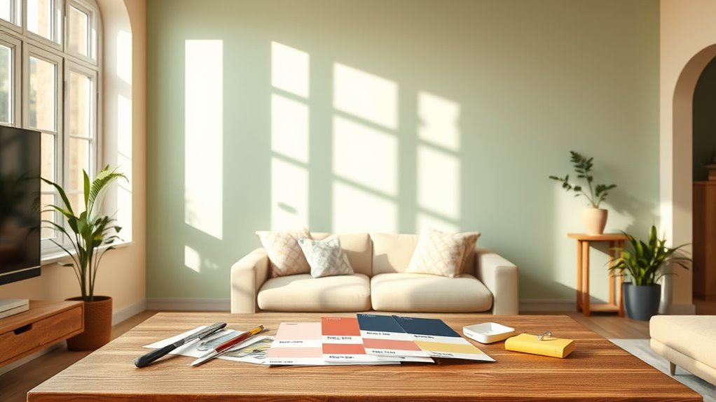
Selecting Paint Colors can transform your space, but with so many options, it’s easy to feel overwhelmed. To simplify the process, start by establishing a cohesive color palette that forms the foundation of your design. Use three to four primary colors as your base, then add four to six accent shades for depth and interest. Layer these colors thoughtfully across walls, ceilings, and trim to avoid flatness and create visual interest.
Remember to prioritize flow by ensuring that color progression between connected rooms is harmonious, which maintains a sense of continuity throughout your home. Limit drastic color shifts between adjacent spaces to keep the overall look cohesive and avoid disjointed feels. Before making final decisions, test your chosen colors in natural and artificial lighting to assess how undertones may shift throughout the day, preventing clashes and ensuring your palette looks just right.
Overcoming indecision can be tricky, but gathering inspiration from various sources like photos, fabric swatches, or nature can help you pinpoint your preferences. Narrow your options to three or five shades per room to keep things manageable. If you’re uncertain, seek guidance from color specialists who can provide tailored advice based on your space and style.
Digital visualization tools are also handy; they allow you to preview how colors will look in your rooms, giving you confidence before committing. Trust the process, knowing that trial and error are part of finding your perfect hues, and don’t rush your decision.
Lighting plays a vital role in how colors appear, so assess your samples under different conditions—morning, noon, and evening light. North-facing rooms tend to have cooler light, so warmer tones might balance things out, while artificial lighting can alter your colors’ appearance—warm bulbs intensify reds and yellows, cool bulbs emphasize blues and greys. Additionally, understanding color perception can help you choose hues that will look great in your specific lighting environment.
When choosing finishes, consider the room’s function. Matte finishes work well on textured surfaces, offering a soft look, while semi-gloss is durable and easy to clean, perfect for high-traffic areas or trim.
Practical steps include collecting large swatches to compare directly within your space and observing how colors shift from room to room. Start small—test paints in powder rooms or closets before large-scale application—and coordinate your colors with existing flooring, countertops, and furniture.
Striking a balance between bold and neutral shades helps create a room that feels lively without overwhelming. Think about the psychological impact of colors: warm tones energize social spaces, while cool blues and greens foster relaxation in bedrooms and bathrooms. Use neutrals to expand smaller rooms and incorporate dark accents sparingly for sophistication, ensuring proper lighting to prevent gloominess.
Finally, focus on timeless choices by selecting neutral bases like greige, white, or cream, which serve as versatile backdrops. Add trendy accents through easily changeable decor to keep your space current without sacrificing longevity.
Being aware of your lighting environment and how it influences color perception can help you make better choices and avoid costly mistakes. Consider testing your color samples in different lighting scenarios over multiple days to see how they evolve—this is an essential part of selecting the perfect hues. Additionally, understanding color psychology can guide you in choosing colors that evoke the desired mood and atmosphere in each room.
With patience and careful planning, you’ll create a harmonious, beautiful home that reflects your personality and style.

FAVOMOTO 1 Set Paint Sample Cards, Standard 83 Colors Sample Cards Architecture Paint Bulk Collections Fan Deck Paper for Home Design and Decorating
Professional Paint Color Cards Set: This bulk collection of paint colors cards features 83 standardized shades, perfect for…
As an affiliate, we earn on qualifying purchases.
As an affiliate, we earn on qualifying purchases.
Frequently Asked Questions
How Do I Choose Paint Colors for Small Rooms?
When choosing paint colors for small rooms, you wanna focus on making the space feel larger and more inviting. Light, airy shades like pastels or neutrals work well, reflecting more light and creating an open feel.
Incorporate soft tones or horizontal stripes to add depth. Balance bold accents with neutral backgrounds, and use glossy finishes to enhance light reflection.
Keep the colors simple and cohesive to maximize the room’s sense of space.
What Colors Work Best to Make a Room Look Larger?
To make your room look larger, stick with light, neutral colors like whites, beiges, or pastels. These hues reflect more light, creating an airy feel.
Use mirrors and reflective surfaces to bounce light around.
Keep ceilings painted a lighter shade to add height, and choose flooring in light tones.
Avoid busy patterns, and incorporate vertical lines or monochromatic schemes to enhance the sense of space and openness.
How Can I Coordinate Paint Colors With Existing Furniture?
To coordinate paint colors with your existing furniture, start by analyzing its undertones and overall style. Use a neutral base wall color, like gray or taupe, to create versatility.
Incorporate the 60-30-10 rule to balance dominant and accent hues.
Bring fabric or swatch samples when selecting paint, ensuring the hues complement or contrast harmoniously.
Test swatches in your space’s lighting to see how they work with your furniture before committing.
Are There Eco-Friendly Paint Options Available?
You ask if eco-friendly paint options exist. Yes, they do! You can choose zero-VOC water-based paints from brands like ECOS Paints, Benjamin Moore Eco Spec, or Sherwin-Williams EcoSelect.
These paints emit no harmful gases, contain sustainable ingredients, and often have certifications like Green Seal. They’re suitable for various surfaces, dry quickly, and help you create a healthier home environment without sacrificing style or color variety.
How Do Lighting Conditions Affect Paint Color Choices?
Lighting conditions greatly influence how your paint colors look in a space. You’ll notice that north-facing rooms make colors appear muted, so you might choose warm tones to balance the cool light.
South-facing rooms boost vibrancy, so lighter shades work well.
East and west light emphasize warm or red tones during the day, while artificial lighting can alter hues further.
Adjust your paint choices considering natural and artificial light to achieve your desired look.

VINCKOLOR Mini Colorimeter, for Color Capturing, Matching, Comparing, Saving, Measure Paint and Digital Color Values Instantly,Color Analyzer with Diameter of 4mm
【APPLICATIONS】This mini color reader is designed for color recognizing. One simple click is enough to measure the color…
As an affiliate, we earn on qualifying purchases.
As an affiliate, we earn on qualifying purchases.
Conclusion
Now that you know how to pick the perfect paint colors, you’re armed with the power to transform your home into a stunning masterpiece. Trust your instincts, experiment boldly, and don’t be afraid to step outside your comfort zone. Remember, your walls are your canvas—your chance to create a space that’s as vibrant and unique as you are. With every brushstroke, you’re making your home more beautiful than you ever imagined possible.

RECOLOR Interior Latex Paint, Semi-Gloss Finish, 1 Gallon, White
PROFESSIONALLY RECYCLED PAINTS: Lower cost alternative to virgin paint, without sacrificing quality. One gallon of Recolor Interior Finish,…
As an affiliate, we earn on qualifying purchases.
As an affiliate, we earn on qualifying purchases.

ALL-IN-ONE PAINT by Heirloom Traditions, Color Confidence Card
We know choosing a paint color can be confusing. That’s why we created the Color Confidence Card, a…
As an affiliate, we earn on qualifying purchases.
As an affiliate, we earn on qualifying purchases.