
Motion typography brings static text to life by adding movement, color, and font pairing to make your message more engaging. You can use animated text to guide viewers’ attention, evoke emotions, and tell a visual story. Properly combining font styles and color schemes creates harmony and contrast that enhance your message’s impact. If you explore further, you’ll discover how these design choices can transform simple words into mesmerizing visuals that leave a lasting impression.
Key Takeaways
- Incorporate dynamic animations to transform static text into engaging visual narratives.
- Use complementary font pairings to create visual harmony and emphasize key messages.
- Apply strategic color schemes to evoke emotions and enhance message clarity during motion.
- Combine font choices and colors thoughtfully to guide viewer attention and improve storytelling.
- Utilize motion typography in various media to boost engagement and communicate messages more effectively.
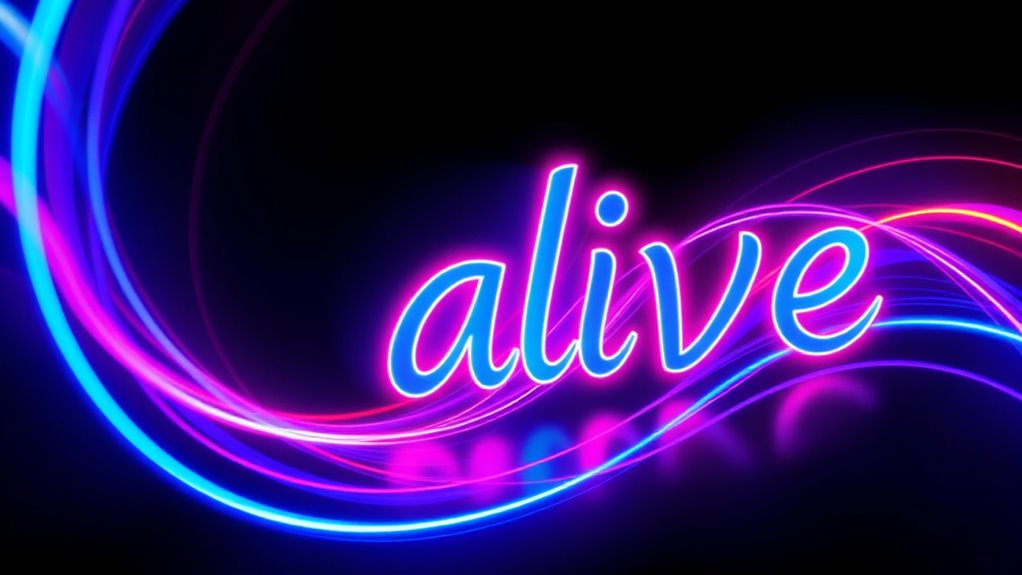
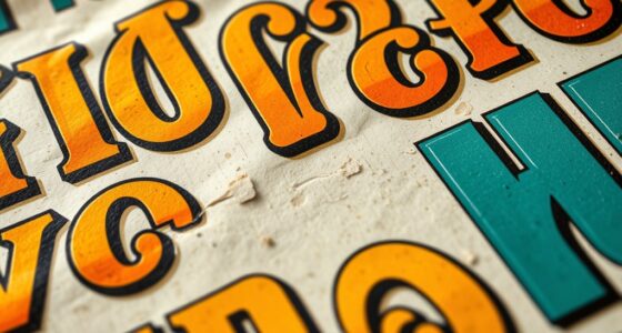
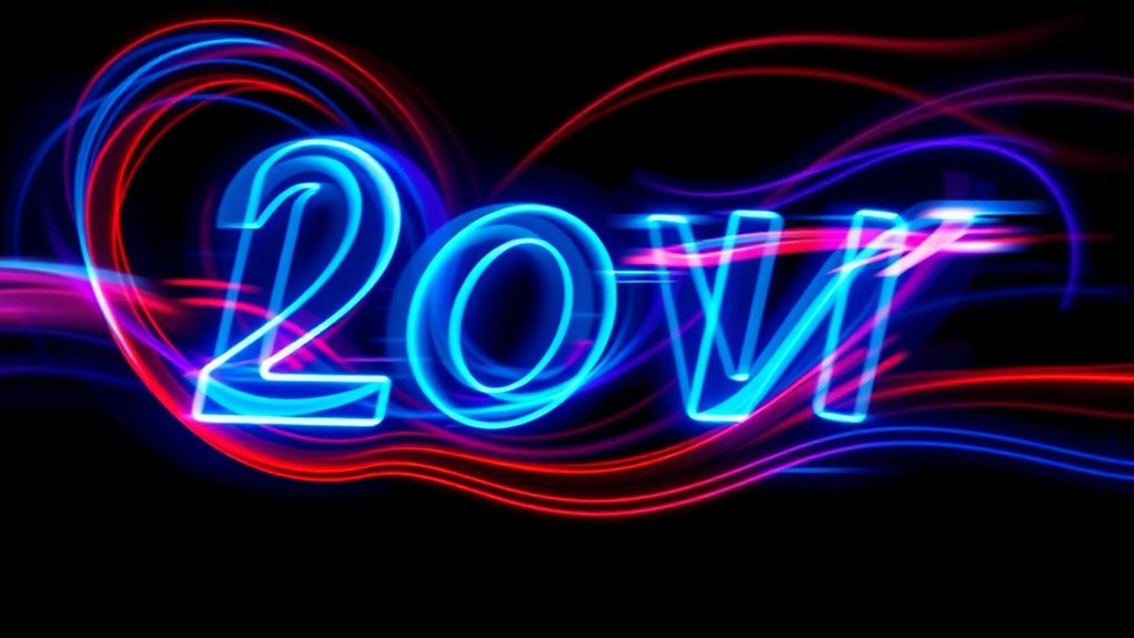
Have you ever noticed how animated text can bring a message to life? When you add movement to your typography, it transforms static words into dynamic storytelling tools. One of the first things to consider is font pairing, which involves selecting two or more fonts that complement each other to create visual harmony. For motion typography, choosing the right font pairing is essential because it influences how your message is perceived. For instance, combining a bold sans-serif with a delicate script can add contrast and interest, guiding the viewer’s eye and emphasizing key points. The goal is to strike a balance—using fonts that work well together without clashing or overwhelming. When you pair fonts thoughtfully, your animated text becomes more engaging and easier to read, even as it moves and shifts. Incorporating sound design techniques can enhance the overall impact of motion typography by creating a more immersive experience.
Color schemes also play an important role in motion typography. They help set the tone, evoke emotions, and enhance readability. When you decide on your color schemes, think about the message you want to convey. Bright, vibrant colors can energize your animation, making it lively and attention-grabbing. On the other hand, muted or monochrome palettes lend a more sophisticated or subdued feel. As your text moves across the screen, consistent color schemes ensure visual cohesion, preventing distractions or confusion. You can also use contrasting colors for different parts of your message to create emphasis or direct focus. For example, highlighting keywords with a different color makes them stand out as the animation unfolds.
Incorporating effective font pairing and color schemes into your motion typography isn’t just about aesthetics; it’s about communication. When combined, they help your text tell a story more compellingly. As your animation plays, the right fonts and colors work together to guide viewers through your message naturally, making the experience memorable. You’ll find that experimenting with different combinations is part of the creative process, and it pays off when your animated text resonates with your audience. Whether you’re crafting a promotional video, a social media post, or an informational presentation, paying attention to these elements can elevate your work from simple text to captivating visual storytelling. Remember, motion typography isn’t just about flashy effects; it’s about making every word count through thoughtful design choices.
Frequently Asked Questions
What Are the Essential Tools for Creating Motion Typography?
You need typography software like Adobe After Effects or Cinema 4D to create stunning motion typography. These tools offer powerful animation features that bring your text to life. Additionally, animation tools such as keyframes, motion presets, and easing help you craft smooth, dynamic movements. By combining the right typography software with versatile animation tools, you can effectively produce engaging, professional motion typography that captures your audience’s attention.
How Long Does It Typically Take to Produce a Motion Typography Project?
You’ll find it takes anywhere from a few days to several weeks, depending on the project’s scope and your creative process. Ironically, what seems like a quick task often becomes a time-consuming journey of refining animations and syncing effects. The project timeline varies as you juggle concept development, design, and revisions, but patience pays off when you see your lively text truly come to life through motion typography.
Can Motion Typography Be Effectively Used in Social Media Marketing?
Yes, motion typography is highly effective in social media marketing because it enhances visual storytelling and strengthens your brand identity. By using animated text, you grab viewers’ attention quickly and communicate messages more engagingly. You can highlight key points, evoke emotions, and make your content stand out in crowded feeds. Incorporating motion typography into your social strategy helps convey your brand’s personality and message dynamically, boosting engagement and recognition.
What Are Common Mistakes to Avoid in Motion Typography Design?
You should avoid inconsistent typography, poor motion timing, and cluttered designs. Keep your typography consistent to guarantee clarity, so your message stays clear. Pay attention to motion timing; if animations are too fast or too slow, they lose impact. Also, avoid clutter by simplifying your design, focusing on key messages. By maintaining typography consistency, mastering motion timing, and keeping your design clean, you create engaging, professional motion typography that resonates with your audience.
How Does Motion Typography Impact Viewer Engagement and Retention?
Motion typography boosts viewer engagement and retention by enhancing visual storytelling and creating emotional resonance. When you use dynamic text, it captures attention and guides viewers through your message more effectively. This active movement makes content memorable, encouraging viewers to stay engaged longer. By emphasizing key points with motion, you create a more immersive experience that resonates emotionally, making your message stick and increasing overall viewer interaction.
Conclusion
By exploring motion typography, you realize it’s more than just animated text; it’s a powerful storytelling tool. When used thoughtfully, it can evoke emotions, emphasize messages, and guide viewers’ attention seamlessly. Some argue that motion typography’s success depends on how well it aligns with the content’s core message, suggesting it’s not just decoration but a form of visual rhetoric. Embrace its potential—when you understand its depth, you open a new level of creative expression.