
When designing for accessibility, focus on creating inclusive color palettes that guarantee your content is visible and understandable for everyone. Use high-contrast color combinations like black and white or navy blue and yellow, and avoid relying solely on color to convey information. Test your designs across different lighting conditions and devices to ensure clarity. Prioritize visual cues beyond color and consider practical tips that help make your work more inclusive—there’s more to discover by exploring further.
Key Takeaways
- Use high-contrast color combinations like black and white or navy blue and yellow to ensure readability.
- Avoid relying solely on color to convey information; include text labels or icons as additional cues.
- Test color palettes with contrast checkers to meet accessibility standards like WCAG.
- Consider environmental factors such as lighting and device differences that can affect color visibility.
- Incorporate visual cues beyond color and prioritize inclusive design practices for diverse user needs.
Have you ever considered how your designs can be inclusive for everyone? When creating visual content, one of the most essential aspects is ensuring that your color choices support accessibility. Good color contrast isn’t just about making your design look appealing; it’s about making sure it’s usable by everyone, especially those with visual impairments. Visual impairments include a wide range of conditions such as color blindness, low vision, or other eye-related challenges. If your designs lack sufficient contrast, users with these impairments may find it difficult or even impossible to interpret your content correctly. That’s why incorporating strong color contrast is indispensable. You want your text to stand out clearly against its background, enabling users to read without straining their eyes or guessing what the content says. Using tools like contrast checkers can help you determine if your color palette meets accessibility standards, such as the Web Content Accessibility Guidelines (WCAG). Remember, what seems visually appealing to you may not be effective for someone with a visual impairment, so testing your designs across different scenarios is paramount.
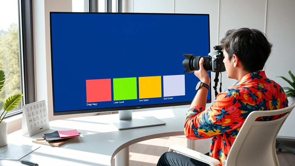
When selecting colors, think beyond your personal aesthetic preferences. Opt for combinations that provide enough visual separation. For instance, pairing dark text with a light background generally offers good contrast, but avoid using colors that can be confusing for colorblind users—like red and green together, which are often indistinguishable for those with red-green color blindness. Instead, consider using high-contrast color pairs that are easily distinguishable, such as black and white or navy blue and yellow. Keep in mind that relying solely on color to convey information can exclude users with visual impairments, so supplementing color cues with text labels or icons is a best practice. This approach ensures that content remains accessible, regardless of how users perceive color.
You also have to be aware of how different lighting conditions and device screens can affect color visibility. Bright screens or poor lighting environments can diminish contrast even further, so testing your designs across various devices and settings is prudent. When you design with accessibility in mind, you’re not merely ticking boxes—you’re making your content more inclusive and user-friendly for everyone. It’s about creating a seamless experience that doesn’t alienate or frustrate users with visual impairments. By paying attention to color contrast and choosing inclusive color palettes, you demonstrate your commitment to accessible design and broaden your reach. Ultimately, accessible design benefits all users by making information clearer and easier to navigate, which can lead to increased engagement and a more positive experience for everyone who interacts with your work.
Additionally, understanding how home improvement principles such as maximizing space and organization can contribute to a more inclusive environment by reducing clutter and improving accessibility within physical spaces.
high contrast color palette for web design
As an affiliate, we earn on qualifying purchases.
As an affiliate, we earn on qualifying purchases.
Frequently Asked Questions
How Do I Test Color Accessibility Across Various Devices?
To test color accessibility across devices, start by checking color contrast using tools like WebAIM’s Contrast Checker. Then, view your design on various devices and screens, ensuring consistent visibility. Remember to calibrate each device’s display settings, as device calibration impacts how colors appear. This way, you can identify and fix contrast issues, ensuring your content remains accessible for everyone regardless of device differences.
What Tools Can Help Create Accessible Color Palettes?
Imagine turning a blurry lens into crystal clear vision—that’s what tools like WebAIM’s Color Contrast Checker and Stark do for your design. They help you guarantee color contrast is sufficient for those with color blindness, making your palette inclusive. You can also use Adobe Color and Color Oracle to test and create accessible color schemes, giving everyone a seamless experience regardless of visual impairments.
How Do Color Choices Impact Users With Different Types of Visual Impairments?
Your color choices directly impact users with visual impairments by affecting color contrast and readability. Poor contrast can make text hard to see for those with color vision deficiencies or low vision. By choosing high-contrast colors and avoiding color-only cues, you guarantee that users with visual impairments can easily distinguish content. This approach promotes inclusivity, making your design accessible and user-friendly for everyone.
Are There Specific Industry Standards for Accessible Color Use?
You’ll be amazed at how strict industry guidelines for accessible color use are! They set the bar sky-high for color compliance, ensuring everyone can navigate your designs effortlessly. Organizations like the WCAG (Web Content Accessibility Guidelines) establish specific contrast ratios and color standards, making sure your palette is inclusive. Following these standards isn’t optional; it’s essential for creating accessible, user-friendly experiences that truly serve all users.
How Can I Balance Aesthetics and Accessibility in Color Selection?
You can balance aesthetics and accessibility by prioritizing color contrast to guarantee readability while maintaining visual harmony. Use tools like contrast checkers to pick colors that meet accessibility standards without clashing. Incorporate subtle shades and complementary hues to create a pleasing palette that’s inclusive for all users. Experiment with different combinations, and always test your design to ensure it’s both beautiful and accessible.

DGK Color Tools Digital Kolor Pro 16:9 Large Color Calibration and Video Chip Chart, 2-Pack
SUPERIOR ACCURACY – Ensures precise color calibration with professional-grade chips, delivering consistent and reliable results for video production.
As an affiliate, we earn on qualifying purchases.
As an affiliate, we earn on qualifying purchases.
Conclusion
Just as Da Vinci believed every detail matters in art, your attention to accessible color choices transforms your design into a masterpiece of inclusivity. By crafting palettes that consider all users, you’re not just creating visually appealing work but opening doors for everyone—like a well-lit gallery welcoming all visitors. Keep this mindset, and your designs will resonate like a timeless classic, ensuring no one is left in the shadows. Accessibility isn’t just an option; it’s your creative legacy.
accessible color blind friendly icons
As an affiliate, we earn on qualifying purchases.
As an affiliate, we earn on qualifying purchases.

50PCS Y2K Compliant Stickers Bulk lot Decal Labels
Super sticky stickers made with quality material and print
As an affiliate, we earn on qualifying purchases.
As an affiliate, we earn on qualifying purchases.