TL;DR

Get home appliances delivered free with Prime
- Fast, free delivery on millions of items
- Prime Video, Amazon Music and more included
- Member-only deals all year
An article in House Beautiful reports that some interior designers are using red in kitchens as an alternative to long-popular white and neutral palettes. The designers quoted recommend choosing an earthy or deep shade and balancing it with materials such as wood, stone and warm neutrals; the report does not establish how widespread the trend is.
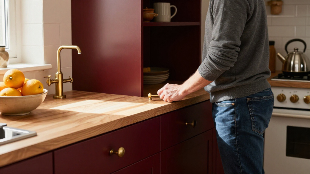
Some interior designers are turning to red for kitchen cabinetry and accents, moving away from the whites and creams that have long been common in kitchen design, according to a report by House Beautiful. The designers featured in the article describe using shades from deep burgundy to earthy red, while pairing them with neutral colors and textured materials to keep the rooms balanced.
The report points to several projects as examples, rather than offering survey data on the broader design market. One city apartment by New York’s Opa Architecture, photographed by Hanna Grankvist, uses Benjamin Moore’s Classic Burgundy on a peninsula. Another project by Lichten Architects combines red lower cabinets with gray upper cabinets. British designer Uns Hobbs used deVOL’s Refectory Red in her own kitchen.
The designers describe different approaches to the color. Hobbs says she favors deeper reds over brighter tomato shades for a more traditional effect. Kevin Lichten says vivid reds can work when they avoid looking “too chemical or artificial,” and cites Benjamin Moore’s Red Parrot as an earthier option. The article presents these as individual design preferences, not a single agreed-upon formula.
For people considering red, the designers recommend controlling its intensity with proportion, contrast and texture. Lichten points to gray cabinetry as a way to temper red, while Hobbs suggests warm neutrals, stone, brass, marble and wood. Aria Jahanshahi of Opa Architecture says supporting materials can soften the dominant color. The source does not provide prices, renovation data or evidence that red kitchens are becoming more common across the industry.
A Shift Toward More Personal Kitchens
The report reflects a design argument about the kitchen’s role: if it is also a place to gather, work and spend time together, designers may treat it as a lived-in room rather than a purely practical space. Red is one way to give that room a stronger identity. For homeowners, the choice can affect a large, visually prominent part of the home and may be harder to reverse than changing accessories or paint in a smaller area.
There is a practical difference between trying the color on a peninsula or a set of lower cabinets and committing to it throughout the room. The featured designers’ emphasis on balance offers readers a way to interpret the examples, but it is design advice, not evidence that red improves a kitchen’s function or resale value. The report makes no such claims.
As an affiliate, we earn on qualifying purchases.
From White Palettes to Red Accents
White, cream and other neutral colors have been common choices for kitchens, according to the House Beautiful report. The designers interviewed say some clients and homeowners now want more personality in their homes. Their examples span several versions of red, rather than one uniform shade: burgundy, cherry, tomato and earthier tones.
The article also addresses red’s associations with energy and appetite, noting that fast-food brands use red in their logos. But it does not provide research about how red affects appetite in a home kitchen. Jahanshahi rejects the suggestion that the look is a response to GLP-1 medications, including Ozempic, and instead describes kitchens as increasingly connected to gathering and everyday family life. That explanation is his view, not a measured finding about why homeowners choose the color.
“People have become a little bored with playing it safe and want more personality in their homes.”
— Uns Hobbs, British interior designer
As an affiliate, we earn on qualifying purchases.
How Broad Is the Red Kitchen Trend?
The source is a design report featuring selected projects and interviews; it does not quantify how many homeowners or designers are choosing red, or compare the color’s popularity with other kitchen finishes. It is not clear whether the examples represent a lasting shift or a small set of individual projects. The article also provides no evidence about costs, durability, resale effects or how the finished kitchens look under different lighting.
Claims about red’s associations with energy or appetite are discussed in the article, but the source does not present studies showing how those effects play out in residential kitchens. The designers’ advice is attributed to them and should not be read as a guarantee that a particular shade or pairing will suit every room.
As an affiliate, we earn on qualifying purchases.
Homeowners Can Test the Color
The report does not announce a product launch, industry forecast or upcoming milestone. For readers interested in the look, its practical next step is to compare samples in the actual kitchen and decide how much red to use. A peninsula, cabinet section or other limited area can provide a smaller commitment than applying the color throughout the room.
Designers quoted in the article suggest evaluating red alongside the room’s existing finishes, including counters, flooring, metal fixtures and upper cabinets. Whether more kitchens adopt the color remains to be seen; the source offers examples and expert opinions, but no follow-up market data.
As an affiliate, we earn on qualifying purchases.
Key Questions
What shades of red are designers using in kitchens?
The report features deep burgundy and earthy reds, as well as brighter options. The designers quoted express different preferences; Hobbs favors deeper shades, while Lichten says brighter red can work if it does not look artificial.
How do designers keep a red kitchen from feeling overwhelming?
They recommend paying attention to proportion and contrast. Examples include pairing red lower cabinets with gray uppers or combining red with warm neutrals, wood, stone, brass or marble.
Does the report show that red kitchens are becoming more popular?
No market data is provided. The article describes selected projects and interviews with designers, so it shows that some professionals are using red but does not measure the trend’s scale.
Does the article link red kitchens to GLP-1 drugs?
The report raises the question but quotes Opa Architecture’s Aria Jahanshahi as rejecting that explanation. He describes the kitchen as a gathering space; the article offers no evidence establishing a connection between medication use and kitchen color choices.
Source: rss
Fall Picks
fall essentials
As an affiliate, we earn on qualifying purchases.